skip to main |
skip to sidebar
Good/ Bad Typography
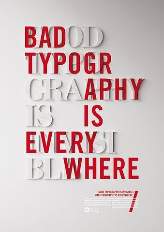
This poster basically sums up how I feel about a lot of the typography I have seen on billboards and signs here in NY. I have seen some spectacular uses of typography, but those good pieces are almost overshadowed by all the bad examples!

No comments:
Post a Comment